Saturday 28 June 2014

A technique I've not tried before

I can't believe I haven't tried this out before - layered embossing....

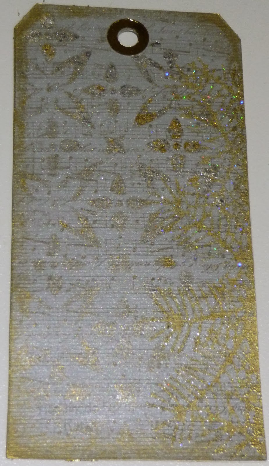
For this, swap the organiser shared some step by step instructions for the technique and we could make whatever we wanted. I decided to play safe and work on an ATC for my first attempt, using very sturdy board as the foundation.

Stage one - cover the entire front with Versamark ink. Then using at least three colours of embossing powder cover bands of the surface in turn before heating to melt. I discovered that my stash of embossing powder is more limited than many other things - black, white, clear (no good for this) and metallics mainly - so I struggled to find enough variety for this experiment.

I used green, blue and bronze in the end for the first layer.


Step two - apply some more  Versamark randomly with finger tip - smearing to avoid finger prints the instructions said, although for a future project I like the idea of deliberate finger prints. I applied silver embossing powder on this layer and heated again.

Step three - using a background stamp (the line stamp from a Paper Artsy Hot Picks plate in this case) apply more Versamark and emboss in white.

Finally stamp the main image in black.

I then added a final layer of clear embossing powder melted on top to even out the surface because some areas were a bit pitted, as if the chipboard had absorbed the Versamark and not grabbed enough powder even with all those layers.

The result is rather limited by the colours I had to hand but if ever there was an excuse to shop this is it. I need some pretty colours to play with further.

Thursday 19 June 2014

Decorative houses

This month's swap - little houses to decorate our craft space. We are meant to make a row of three houses (with hanging loop) but I used the Tim Holtz dwellings die so  I had to make four. It would have been wrong to leave one out, how would I decide which one?

The rules of our swap were few - well only one really, that each house had to be no bigger than ATC sized so I had to chop the bottom off some of the die cut shapes.

 
Each is covered with part of the same gelli plate print which went from dark blue to lime green via shades of greeny blue in between. The windows and doors were stamped with Paper Artsy stamps.

The windows are glazed with glossy accents and each roof has texture added with matte accents or crackle glaze.

I jollied them up with a bit of contrast using die cut flowers. All four are mounted on to a strip of sturdy card with a tab to hang it from. I hope the recipient likes bright colours!

Saturday 10 May 2014

Oops I did it again...

Another case of stamp first think later..

Another month, another ATC swap and this time it actually calls for a gelli print back ground. Yippee, I have a box full to use.
 
The first one that came to hand was a pink print made using a flower stencil - with bits of blue from a previous print mixed in. Still in a bright spirng mood I continued with the floral theme by making flowers out of fusible fibres which were an indulgent purchase from the Clarity stand at GNPE recently. The picture doesn't really show them very well - they are super sparkly especially with the extra bling I added to the centres.
 
I dyed feathers to pick out the blue in the background - well I say dyed but really I just sprayed them with Dylusions ink and left them to dry.

And then before I assembled the ATC's I wrote on the backs thinking it would be easier if I did it before adding the lumps and bumps....

.... but I then looked at the patterns on the front and turned them this way and that before deciding which parts of the flowery background should be left uncovered. I glued all the embellishments down and then found the writing on the back was upside down when the front was the right way up. Honestly you couldn't make it up.


Saturday 3 May 2014

Doh!

I really should learn to read instructions and think before I start!

The postcard swap technique this time round was using one of Nancy Curry's surface alteration techniques to create a background to stamp over. Look here to see examples.  This is a bit like doing a gelli plate background to print but using a shadow stamp (or piece of craft foam, or acrylic block or even just craft mat) as the plate.

I love the way the edges are distinct and chose to leave a border round my postcards.

I made this print first with Brilliance inks. I used scrunched up cling film and bubble wrap to add texture.

 
There was enough ink left behind to make a second, paler print which looks just like a cloudy sky.

 
Having happily stamped and coloured onto my backgrounds I refered back to the instructions only to discover I was supposed to make landscape cards not portrait ones.
 
Doh! Off to start again now.

Saturday 26 April 2014

Spring has sprung

Spring has sprung and with it I have reverted to bright colours and contrasts.

More ATCs to swap this time and the theme was to use stencils or die cuts. Needless to say I had to go the whole hog and squeeze both in.

My background is a gelli plate print made using Crafters workshop stencils to create the harlequin and circle patterns. I have die cut fronds from Crafty Individuals background paper (book 3 Spring of course) and used chip board die cuts coloured with acrylic paints too - mainly because the paints were still out from the previous swap.


Saturday 19 April 2014

Way out of my comfort zone

One of the swaps I joined in March was to make a postcard using a technique specified by the swap organiser. On this occasion the technique involved painting over a background of cardboard shapes and crinkled tissue paper.

Check out Therese Urbanska's blog - she has some pretty Christmas decorations made using this technique.

Needless to say I launched in with no proper forethought - and glued a bird shape to my postcard and covered it with crumpled tissue no problem. Then I got to thinking about the painting but I really should have done that first.

Me and my rules - I decided I'd have to use brown (because my bird is a sparrow) so what with my lack of painting skills the end result is not exactly eye catching. Oh well, live and learn.

Saturday 12 April 2014

Home alone

 
A very rare occasion today - I find myself home alone with time to "play". Funny how with some free time and an empty kitchen to spread out in inspiration disappears. I suspect it is the result of having too much stuff - makes it too difficult to decide where to start.
 
So first I played silly games on the computer until I ran out of lives... and then I went blog hopping and on-line window shopping. Whilst doing so I came across some really useful inspiration on the Sprinkle of Imagination blog where they have a colour challenge.
 
The background started life as a cake board recycled from Christmas with a layer of book pages and a coat of gesso. I stencilled on some green paint and then over-stamped with Crafty Individuals Crackle background to start with.
 
I had a root about in my stash and dug out some gelli print backgrounds in mauve and got started. I've also used various other backgrounds and printed papers including Crafty Individuals book 3 Springtime to die cut lots of flowers and foliage. I seem to have a lot of purply shades but had to paint some paper flowers plum coloured.
 
So here is my May Queen - looking I fear a little bit like an alternative Christmas wreath. Whatever, I had a nice time making it as evidenced by the amount of mess I made. I really will have to get on with some housework now!


Sunday 9 March 2014

Ready, steady, craft

My second swap of the year had a bit of a twist. We had to make ATCs using materials provided by the recipient of our end product, so much like Ready,Steady,Cook we had no idea what sort of theme or methods we might be working with until a mystery parcel of "treasure" arrived.

And what a bumper bundle it was, with enough materials to make twenty or more ATCs nevermind just the two for the swap. Whilst it wasn't specifically stated in so many words in my mind the "rules" were to only use what had been supplied and for the first ATC I made, apart from glue, that is exactly what I did.

The image in the background is a transparency in lovely vintage shades.I got a bit carried away on this I think trying to use everything all in one ATC - so there is some magic mesh down one side and then the whole is veiled by a layer of wide organza ribbon. I've topped and tailed to stop frayed ends using the edges off a sheet of ATC images cut with deckled scissors. And then added fabric and paper flowers on top - maybe a step too far in hind sight but I like the pop of brighter colour.


For the second ATC I took a Gelli print made on computer listing paper I think (the old type with holes at the edge). I added a bit of colour with Distress ink to tone down the white so that it fitted with the picture of ladies paddling which had been torn from a magazine. I think the shell I added was actually a seed pod - it came from a sheet of botanical images (line drawing type in black on white) - and I coloured it with pencils. To finish I added a dot of turquoise to brighten the ladies hair ribbons. So more restrained but was it cheating to add my own colours?

 
My third offering would have fitted with the frozen theme. My goodies included several pages of text and illustrations from German books. Basically all I did here was combine the text from one (no idea what it says!) with the illustration of children making a snowball. I added shadow with a charcoal pencil and sparkly highlights with a glitter pen.

 
And finally off at a tangent again.... the stems on this ATC started out as some very bling braid in gold and red. I unravelled it into its component strands and glued these down to create the texture and painted the whole lot white. I then used more of the magic mesh as a stencil to spray ink through (oops cheating and adding things again) and rubbed green paint over the top with my fingers. The butterfly die cut was one of several in my pack of goodies although I must confess I have glitzed it up with glitter pen.

 
It is interesting to see what other crafters keep in their stash. I use book pages a lot in backgrounds, often virtually concealed and only adding texture and I am quite good at hoarding bits and pieces in case they come in handy but I never remember to cut out and keep magazine pictures. I will try to do so in future.


Sunday 2 March 2014

An unseasonal swap

My first swap of 2014 had the theme "Frozen" which for February would normally be quite appropriate. This year though the weather just seems to have been endlessly wet but not extermely cold (I suppose I'd best add so far - I'm sure there is still time for snow in Yorkshire!).

We were swapping sets of 3 ATCs. I started out with a Gelli Plate background in shades of icy blue and lilac. For the first of my ATCs I used a sheet of crumpled fusible film on top for a lovely shiny icy top layer with little pieces of mica trapped inside to catch the light even more.

 
The second ATC uses some of the same background print as the base. On top this time I have used Croco paint and embedded into it on the left hand side some magic mesh and a sprinkle of glitter. This one has a properly hard texture to it just like ice/

 
And then for the final ATC I went a bit off at a tangent. Instead of sticking to the background paper I used the baby wipe I had cleaned my Gelli plate with as the base and embellished on top with angelina and other fibres including scraps of muslin coloured with Dylusions spray. It fits the colour scheme nicely and has pretty sparkle like frost but I have to say the texture doesn't seem the least bit frozen - I suppose thinking laterally it is rather like a woolly scarf you might wear in the cold.

Sunday 16 February 2014

12 days of Christmas in February?

For the last five years I have participated in a wonderful crafty swap where 13 like minded crafters each make 12 identical (well very similar) gifts. These are then swapped with the other participants to that everyone gets one of each other person's gifts. This is our 12 Days of Christmas swap and it is such a treat.

It is quite a challenge just to think of something different to make each time that is not too large or heavy but strong enough to stand up to two postal journeys - one to "Santa" who puts together the parcels and the other to the recipients. In the past I have made key rings, stuffed animals, calendars and buttons. these and the gifts I got in return are the subject of (much) earlier posts.

This year I made door (or wall) signs using MDF blanks that just fitted into a shoe box for posting.

 
I started by painting gesso over the whole sign and then used a chocolate brown coloured paint round the edge. The colour in the close up photos is a better representation then the one taken of the sign hanging on the wall.
 
I die cut letters from chipboard and glued these and lots of art and craft bits and pieces down with gel medium Glossy Accents.


I used all sorts of things including pencils and old paint brushes ( I have so many with gummed up bristles!). I painted over everything with gesso to disguise unwanted colour and used spray inks with pearl powders over the top to create a unified, aged, stained look.


I finished off by highlighting the letters and other details with Treasure Gold and dyed string with Walnut ink to create the hanging.

Sunday 9 February 2014

Warning - very shiny

Anyone who has visited my blog before will know that photography (and electronic things) are not my forte. I struggled to take pictures of these gold and silver tags - the pictures don't show the background detail at all well.
 
This first picture is of what I thought of as the back - mainly because it is flat. I used ribbed silver pearlescent card as the base. First I stamped music with versamark and applied pearl powders. Then I stencilled with Flitter Glue and applied gilding flakes in a mixture f gold and silver. I used a die cut to stamp with versamark down the right hand side and embossed with glittery embossing powder. And finally rubbed Treasure Gold round the edges.
 
Well is you're going to do bling you have to do it properly!
 
 
The front of the tag is cut from gold Mirri board. I have stamped Christmas script (a Crafty Individuals stamp) with Brilliance Gold ink on top and heat set it to get a matte contrast. This is toped with a die cut, some spangly ribbon and some sequins for maximum sparkle. This was the December, Christmas swap after all.


So next time is 12 days of Christmas and then properly on to 2014.

Sunday 2 February 2014

That fooled you

I think I said last time "expect shiny" in this post, but as I browsed our swap group photo albums I remembered we had done a mini canvas swap.

Now normally I am a stickler for rules but with my mind full of other things at the time I didn't pay proper attention and my canvas was a smidge smaller than the size parameters we had agreed. Fortunately I confessed early and didn't have to start again. The canvas is just less than 4 inches square and it is surprising how many things can be squezzed in to such a small space. It is a bit like the game we played as children  - fitting as many different things as possible into a match box. Now there's an idea I might come back to...

I used a Crafty Individuals image in the centre and coloured the piece to match the vintage photo look.

The picture is surrounded by all sorts of pretty odds and ends all glued in place with gel medium or glossy accents. As usual I've used whatever I could reach so the ric rac from my last tags features. there are also buttons, beads, paper flowers, scraps of lace and some floral bits die cut from craft foam using a Memory Box die.


Once everything was stuck down securely I masked the image and painted gesso over everything else to tone down any existing colour. After this I applied some pink and beige paint to match the central image as best I could, and finished with a good spritz of Moonshadow mist to add vintage look walnut stain and a mica sparkle that you don't really see in the photo.


Sunday 26 January 2014

So far so good...

If I keep this up I'll have finished 2013 before half term! Meanwhile on to last November's tag swap which was black and white themed.

Those who've seen previous posts will spot tell tale signs on my methods of working here...

There are more scraps of old patterned papers and more splattering - I had the scrap box and inks out for the September theme and just kept using them.

 
I used layer after layer to create a grungy look with stamping, stencilling and splattering applied on top of the patterned papers. I should have kept the poor man's face clear but I was a bit carried away with my new Dylusions white spray. The reverse side is embellished with odds and ends that fit the colour scheme. This one appears to have some ric rac braid and a stamped jigsaw piece.
 
Now December's theme I do remember because we've only just received the swaps this week. It was gold and silver so expect something excessively shiny in my next post.

Sunday 19 January 2014

Testing my memory

I'm still in catch up mode with my posting and I'm struggling to remember which colour scheme we swapped in which month because I have left it so long to blog.

I think October was lime with a touch of pink. My backgrounds are both made with ink sprays. I am still using on old Dylusions lime spray with mica in it which is very vibrant. On one side I used and alphabet stencil and on the other I spritzed my craft mat with ink and water and squished the paper around in the resulting puddle.


Now I look at this picture I am more certian this was October's tag because I have used the same die to cut the flower as I did for September's. This suggests they were made close together as I'm not very good at putting things away - but once I have I tend to reach for what is at hand before going to get something specific back out.

The little birds were stamped onto some remnants of Blonde Moments paper and cut out. The stamp is a Karantha one.

It looks as though there was some splattering going on too - I think there was an article in Craft Stamper around then using spatter techniques.

Sunday 12 January 2014

New Year again...already!

Once again New Year is upon us - so best wishes for a happy and creative 2014 to everyone.

As usual I am starting out filled with good intentions to be crafy and blog more regularly whatever setbacks come my way this year.

Fortunately I have a few of last years tag swaps and the annual 12 Days of Christmas extravaganza to share with you so I should manage to keep going for the next few weeks whilst we get back to normal routines.

And casting my mind back, September's coloured tag swap was red with a touch of green which I approached with some trepidation. It is not a combination I find easy except for Christmassy things and it took quite a lot of messing about before I was even vaguely happy with the results.

I started out with bright red (scarlet) corrugated card. You can just see bits of the original colour peeping through. I ran it through an embossing folder first and then heat embossed the ridges with Versamark and clear embossing powder. The result was too red so I rubbed some cranberry coloured paint into the crevices (see what I mean about Christmassy). I think it then ended up too pink but it was too late to go back. I added a bit of pistachio green paint in places to match with the flower embellishments. The large green flower was die cut from scrap card and coloured with spray ink. The red flower started life white and was also sprayed with ink. The middle is a sequin.


Whilst I had the spray inks in my hand I used a stencil to make background paper for the reverse of the tag. I think there is a flourish and a script stencil in there somewhere. On top I layered some hand made (not by me I have to admit) papers and a die cut in the hope that flowers would make it lass Christmas like.