Friday 6 September 2013

Nature hanging book

A long time ago - before the summer holidays started - I mentioned that I was doing a hanging book page swap with a nature theme. Each participant had an assigned colour - so that in the end we all have a page in each colour of the rainbow. The luck of the draw had given me orange to work with. After my difficulties with orange when it was the colour for the tag swap I was more than a little concerned but I am reasonably happy with the end results.

I used an old book page from an encyclopaedia of shrubs as the background coloured with Distress Inks. I used the wrinkle free method to get overall coverage and then stencilled using Cut'n'Dry foam and stamped to add pattern. The stencil is a Crafters Workshop one called Tie dye but the swirl pattern reminds me of a nautilus shell and makes a brilliant tiger pattern too in black over orange.

The image is from Crafty Individuals layered onto some hand made paper. I sneaked in another die cut (still enamoured with these) and embellished with other natural bits and pieces including wheat courtesy of the birds who throw the birds seed about in the garden so it grows like weeds.

I now need to think about how I'm going to hang all my pages when I get them - off to search for a nice stick I think.

Sunday 1 September 2013

Back to the daily routine

Hard to believe but its back to the daily routine tomorrow after what has been a post GCSE extended summer break. You'd think having a few days off work now and then to make sure my son didn't take route in a chair in front of the telly would have given me time to craft and blog but the amazinbg weather has instead got me out in the garden growing things.

So with apologies for being an absent blogger, here are my August tag swaps - yellow with a touch of orange. Lots of lovely spray ink and stamping on one side - Dylusions and Distress Inks using Stamp Man and Paper Artsy stamps. On the reverse I've used up assorted images from Artchix sheet and stencilled texture with Distress Crackle paint and Distress Ink.

It is red with a touch of green next which sounds quite a scary combination to me!


Friday 19 July 2013

Litte houses all in a row


I made these houses using some colour wash spray backgrounds left over from a previous swap.

I used Versamark ink through a Dina Wakely church windows stencil to create embossed windows. To make these stand out more I applied Distress Ink over the top to darken the areas around the windows. I then cut the size and shape of each house to fit with the window patterns. Some of the shapes then put me in mind of particular types of houses so I had to give all of them names.

The swap required the inclusion of lace somewhere in the design. I used markers to colour the snippets of lace and added tiny buttons as handles for the doors.

These are Bleak House, Green house and Work house.

 
And these are House of Lords, Out House and House of God.

 
I'm looking forward to receiving houses back from other swappers. The added surprise of the different shapes and sizes is always fun.

Friday 5 July 2013

Back on track

The colour scheme for July's tags is blue with a touch of green. And guess what...Look no die cuts!  

I went overboard on texture for the front. The large circles are stamped with bubble wrap using glue, with glitter sprinkled over the top. The small circles are Distress Crackle paint spread through sequin waste and sprayed with ink once dried and cracked. I then doodled dots and circles with coloured pens and added green Stickles highlights.

 
The back is a spray ink background with a ghost like image applied over the top with Versamark ink and chalk.
 
I'm not sure what colour comes next for the tag swaps but I have signed up to swap nature themed hanging book pages in August and my allocated colour is orange - you have been warned!

Saturday 29 June 2013

Is anybody there?

I really hope not every one has given up on me after a protracted absence.

I haven't done much crafting of late - May's posts were all created and scheduled early because of serious illness in the family and since then we have had two breavements so I'm only just getting round to crafting again between catching up at work and helping out with estate admin.

June's tag theme was green with a touch of blue. Well what with the huge volume of rain this spring and the recent warm weather everything in the garden has suddenly started growing - so green meant leaves,trees,plants....

You'll see the fixation with die cuts continues on the front.


On the reverse I used a spray ink background and stamped instects to add the touch of blue. Fairly basic but at least it got the creative jiuces flowing again.

Friday 24 May 2013

Tag time


After the trial of last month's tag swap in orange I found the May colour scheme of white with a touch of gold much easier to deal with.

I'm sure I have said a hundred times before that I usually buy white embellishments and colour them, so I had lots of things I could add to this months tags.

If you look carefully you will find book pages, doillies, feathers, flowers, die cuts (still obsessed) and buttons made from polymer clay on the front. I only just remembered the touch of gold and added some toned down gold brads to the book plates.


On the back I used molding paste and gesso through stencils to create texture over painted book pages for a minimalist contrast to the mountain of different things on the front.

Thanks for taking the time to look.


Friday 17 May 2013

More inchies

I knew I would eventually get round to using some of the many Gelli print backgrounds I made. I'm going to have to make an awful lot of inchies though to get through the ream of A4 sheets!

The challenge for this swap was to cover a 6" by 4" postcard with inchies using a maximum of three colours. I've chosen blue, green and turquoise which counts as three even if I've used lots of different shades doesn't it?

So armed with a mountain of coloured backgrounds I punched out squares with interesting bits of pattern on them. I then either stamped an image or glued an embillishment on to each one before assembling the postcard.

In my usual fashion this involved colouring some bits and pieces to fit the theme: spray ink on the fabric flower, Brilliance ink heat set on the heart shaped button and alcohol ink and StaZon on the giant brad.

I couldn't resist a bit of doodling with gel pen and the odd bit of Stickles glitz to finish.


I haven't made a lot of inchies before and have found working on such a tiny scale quite hard. I'm really looking forward to seeing what my swap partner has made for me - hoping to get lots of good ideas and inspiration for tiny projects in the future.


Friday 10 May 2013

Inspired by Dyan

One of the swaps I am doing in May is to make an item using colourwash spray. Eagle eyed readers will no doubt have noticed that I use spray inks in quite a lot of the things I make. I love how quickly I can create a background using sprays and I enjoy the messy unpredictability - speaking for myself here, I'm sure others make perfectly planned, neat effects with their sprays.

So to cut out a great deal of umming and aahing over what to make I decided to go all out with sprays and nothing else. Inspired by a great class that Dyan at Art from the Heart ran a while back I decided to make a journal where every part was coloured using sprays.

I used sheets of watercolour paper as the base and sprayed Dylusions inks through a variety of stencils to create colourful pages.

 
The pages are folded in half and then stuck back to back to create the book. The spine is covered with a piece of sticky backed canvas. The ribbon tie and ric-rac braid are coloured using spray ink too. I nearly always buy white and colour it myself in this way.
 
Here are pictures of the finished book: Closed...


....and standing open.

 
I just hope my swap partner likes bright colours and journalling.

Wednesday 1 May 2013

Have a heart

In April a group of fellow crafters and I have been altering some wooden hearts. I think they started life as Christmas decorations and were in a sale at 10p each. They had natural dark wooden front and back surfaces to start with, but not for long.

Often I find I spend more time trying to decide what to do than actually getting on with a project but in this case I had a new toy to try out - Kroma Crackle paint from Indigo Blu - so I knew there would be some texture involved.

I hadn't used this product before so I was interested to see how easy it would be. On the front I don't think I used a thick enough layer, and perhaps added too much paint to the mix. There is definitely a very even crackle pattern created but on a very tiny scale. To contrast I used Terra paint on the right hand side and stamped into it to create bold texture. I painted over the terra and sprayed the whole heart with spray ink which settled into the cracks and stamped indentations. This side is quite an orangy red overall with gold higlights.


On the reverse side I applied a thicker layer of Kroma Crackle with less paint added, hence the paler pink colour. This gave crackle on a larger scale and with more texture because of the bigger cracks - much more what I was looking for. I think there will be more projects coming along that feature crackle now I'm getting to grips with it. I used tissue tape to cover the portions on either side of the crackle and then sprayed ink over the whole again. I don't think the picture represents the colours terribly well. They aren't quite so fierce in real life.
 

I've signed up for a quite a few swaps next month so please call back soon.


Friday 26 April 2013

Disasterous orange!

Well I did warn you... I had a really difficult time with the April tag swap. The colour theme was orange and I just could not get to grips with it.

No matter how many ways I mixed different yellow, pink and red paints and inks everything seemed to end up the same colour, and every sheet of paper and card I had in orange seemed virtually the same when put together - not that there were many to choose from. I don't naturally tend to select orange.

Completely stuck, I had to beg the lovely swap co-ordinator to allow a bit of something else, and my desperate pleading resulted in a small amount of copper being allowed. Even so in the end I admitted defeat. I had added so many bits and pieces - and cheated dreadfully by using some collage pictures with more than a little unpermitted colour - that I was making things worse instead of better.

Anyway, here they are complete with die cuts again. I am more than a little fixated with these Memeory Box dies at the moment.

 
I am a bit happier with the backs. I managed to stop myself adding more and more and more. I think having permission to use copper by this staged probably helped although I'm not sure this large image counts as a little.


Next month the colour theme is white. I think texture is definitely the way to go. I hope you call back to see how I get on.

Friday 12 April 2013

Challenge Time Again

In the new issue of Craft Stamper that came out last week there is a beautiful project by Helen Chilton using a tearing technique to add dimension. This is the technique featured in the latest Make It, Take It Challenge on the Craft Stamper blog. Do take a look and then join in for a chance to win.

The technique this time is much more my style. Tearing and grunginess I can do!

With the days now longer and occasional glimpses of sun appearing I have chosen some very light and airy colours. I am trying really hard to feel Spring like despite the cold.

As well as tearing I seem to have used quite a lot of die cuts in this project. The arches were marked out using Sissix thinlit arch dies as a template and the rosette and foliage are die cut from paper and funky foam.


To keep things light and bright, I didn't ink the torn edges on my project. Instead I applied some PVA using a bit of sponge and then sprinkled on glitter. I sabotaged the edges of the rosette by tearing and glittering in the same way.
 
The central image is a Lynne Perrella stamp from Paper Artsy plate 011.
 
OK so that's my take on the theme. What's yours?

Wednesday 3 April 2013

Ooops! Back to my bad old ways...

And here it is, the third of April after a very long weekend and only just posting a March swap. Tut tut!

I did manage to actually get the swap sent out in good time though, it is just that rotten bits of real life got in the way of on-line posting.

Players in our swap each made six mettalic inchies so I'm eagerly awaiting six back from six of the other players. I love joining these swaps because everyone has such different skills and techniques to share and I find I learn a lot by seeing the actual art work up close and if I can't figure out how something was done, or what with, the artists are always ready to explain.

 
Being one for rules, metallic for me meant use metal. In fact I embossed some Paper Artsy metal covered card as the basis for my inchies and used a punch to cut them out. They are coloured with alcohol inks and Brilliance ink pads (heat set).  On some I added some extra sparkle or used a pokey tool to add texture. Each one has a small metal embellishment added to finish.

And to finish, a quick reminder that the current Craft Stamper Take It, Make It Challenge ends this Friday so there is just time to get an entry in if you want to take part.


Tuesday 19 March 2013

And you thought I'd fallen off the wagon...

I bet after a whole month with no post you thought I'd fallen off the wagon with regard to my new year good intentions to keep up to date and be on time with swaps.

I'm pleased to say that is not the case. I am still ahead, although just a week early for the March tag swap deadline, and I have already made a start on some April things in my efforts to keep up the good work.

You might not think it but I don't like being late with things (that film with John Cleese called Clockwise could so easily have been about me) so building in a bit of just in case time when I can is a good thing.

So here are my amethyst tags. We were allowed to use a little bit of silver, gold or white but as you might just be able to tell a smidge of turquoise sneaked into some of my backgrounds because I am a messy worker and don't clean my gelli plate.

The fronts are gelli print backgrounds with a layer of Rock Candy over the top to get a nice crystalline effect in keeping with the amethyst theme. For contrast I have added matt leaves cut from book pages and sprayed with Dylusions ink, and some velvety flowers with a bit of glitz.

 
The reverse sides are covered with layers of patterned paper, overstamped with Dusty Concord Distress ink and Picket Fence Distress Stains. On the left hand side I have added a die cut embellishment cut from glossy card coloured with alcohol ink.
 
 
I have to say working in just one colour is very challenging. The temptation to add a bit of contrast is hard to resit and I find I keep adding more and more in the hope of somehow achieving that missing something without success. And if you think these are a bit messy and frantic wait until you see the travesty I made with orange as the colour theme for April. Not my finest hour but I'm sure I must at least have learned something from the experience.
 
Thanks for taking time to look. 

Saturday 16 February 2013

February swaps

This month I joined a swap to make three ATCs using text as the base. Now I use old book pages and old music score in a lot of my projects but you wouldn't always know, as by the time I've added paint and ink and other stuff, it is usually well covered up. In this instance though I wanted the text to show through - evidence I suppose that I had followed the instruction.
 
In my usual experimental way I painted ModPodge over the text to seal it and then used alcohol inks to add transparent colour. Probably not a recognised combination and for a reason. The ModPodge becomes a bit tacky when you apply the alcohol ink. It dries fine in the end but my felt kept sticking to the surface as I dabbed.
 
I then stamped circles and dots (using a Paper Artsy mini) and filled some of them in with a white gel pen. With the lighter mornings and Spring (briefly at the time) in the air I chose borders and flowers in bright colours to contrast. The paper was coloured with Dylusions ink sprays prior to stamping and punching. 
 

So well into month 2 of the year and I'm still upto date with everything. Visit again soon to see how long it lasts!

Friday 8 February 2013

Craft Stamper Blog Challenge

Over on the Craft Stamper blog there is a challenge running to create something using the faux airbrush technique featured in the Distress to Impress article by Joanne Allison in the March issue of the magazine out now.

What can I tell you... for me this really was a challenge! I am not a neat and tidy crafter, and being left handed I tend to be rather heavy handed too so the lightness of touch needed for this technique did not come at all naturally.

With the benefit of hindsight I would also recommend careful choice of card or paper for this technique. If you've visited my blog before you'll know my craft is experimental and somewhat unplanned. I use whatever comes to hand, including the first sheet of plain card I come across when I need one and usually this is OK. However, for this technique, to deliver the desired dotty effect, you need card that isn't too absorbent. I'm sure smooth coated stamping card would be reliable but I'd recommend you do a test on any general cardstock you are planning to use to make sure the ink doesn't bleed - otherwise no amount of care will stop the ink blending into a solid area.

Any way after a few (how many is a few?) false starts I eventually mamaged to create a piece of airbrush style background using a Crafters Workshop template and Distress inks in shaded lilac and peackock feathers.

I then used the same technique to colour a stamped image (from Dark Room Door Venetian Vol.2), added a punched trim and some bling to creat a simple card.


Visit the Craft Stamper blog to join in the challenge. I look forward to seeing what you create.

Friday 1 February 2013

Craft Stamper Blog Hop - Looking Back


Welcome to this stop on the Craft Stamper Blog Hop looking back at favourite crafty things of 2012. If you didn't arrive here from Helen Chilton's blog you are missing out on fun and prizes! Pop over to the Craft Stamper Blog to start your journey at the beginning.


I'm Kate and I joined the Craft Stamper Design Team around three years ago after winning Stamper of the Year. For me crafting fun is as much about experimentation and the process of creating as it is about the finished piece. I work in a very organic (and messy) way, usually with the smallest germ of an idea to start with and just see what develops.

I have been making things since I was a child, making clothes and knitting as well as doing papercraft and mixed media experiments and confess to having lots of unfinished projects lurking as I get distracted by a new idea or new must have product.

Looking back at 2012 I wouldn't like to confess to how much new craft stuff I obtained. Suffice to say it significantly outweighed the amount I used! I was lucky enough to get an embellisher machine of which more later (much later as I am still learning to drive it ). But of all the things I got last year the most used and loved, as of now, is my Gelli Arts printing plate.


If you haven't come across these yet take a look at their blog or at the February issue of Craft Stamper for ideas. You can get fantastic results really quickly and easily with a very basic technique or develop ideas and skills further with very artistic results. I find the process of making prints somewhat addictive and made a huge batch of background papers as soon as my new toy arrived last summer.

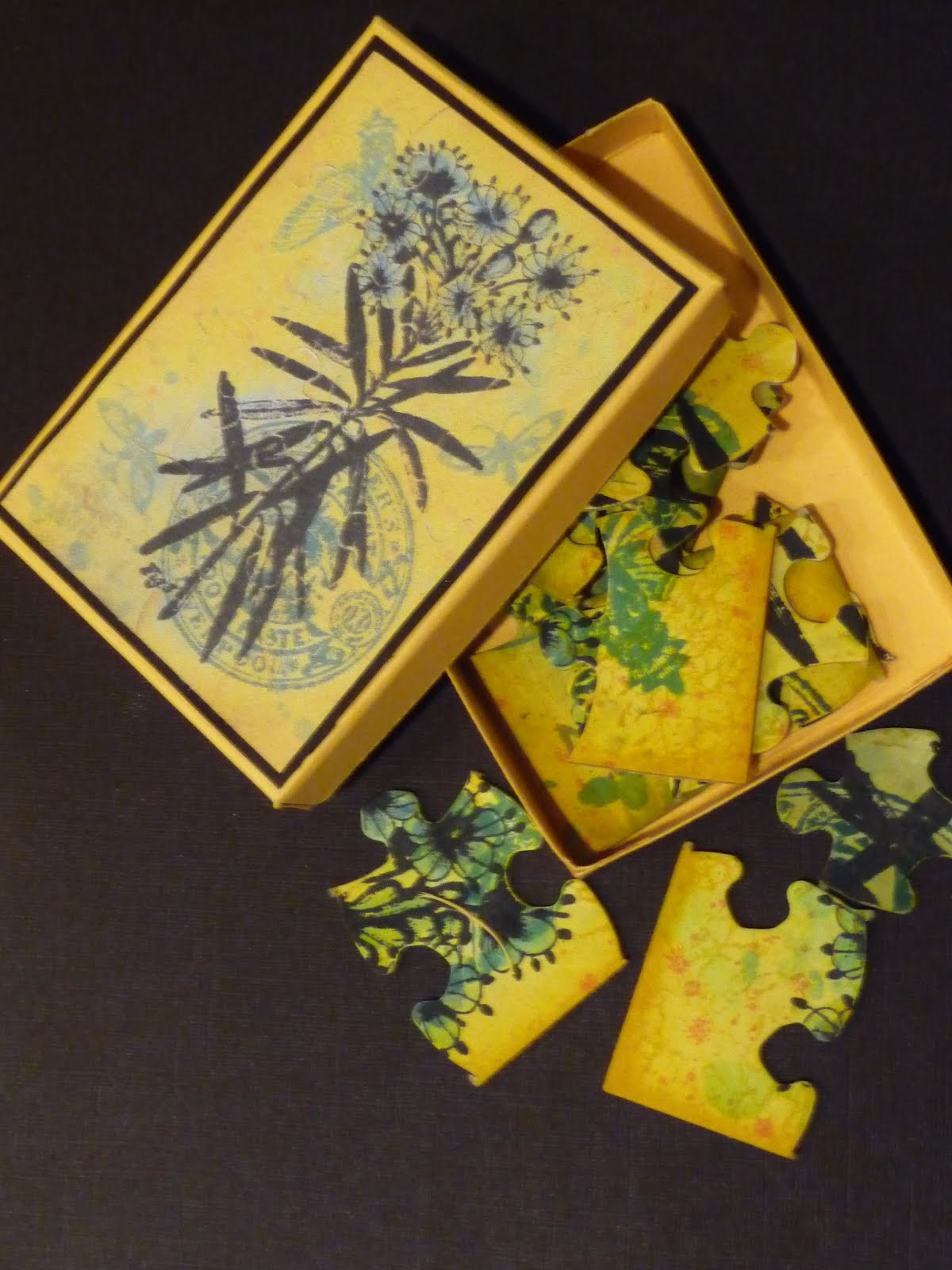
Here are a few of the first background prints I made...

This is the absolute basic method - if I can do it anyone can. Truly it is simple. You get your Gelli plate out and put it on a smooth (imprtant so you don't give it a permanent pattern from any texture that a craft mat may have) surface. Add some small, and I mean small, blobs of paint. Roll the paint out into a thin layer with a brayer then make patterns with whatever stamps, stencils and other materials you have to hand.Then lay a sheet of paper - or fabric - over the top and burnish gently with your hand and peel back to reveal your print.


You'll find that bubble wrap crops up in virtually all the prints I have made so far. It is fantastic for making patterns, is soft so it doesn't harm your plate and best of all you don't have to wash it up. I am a very messy worker and find cleaning up a chore. Working with paint does mean a lot of washing up to keep your stamps and stencils in good condition. I am now thinking up ideas to use painty bubble wrap in projects - I have lots and can't bear to send it off to land fill without at least one more use first.
 
The next print is actually three or four prints on top of each other - made each time using the dregs of paint left after an initial print. A convenient way to substantially clean your plate without wasting paint. Whilst I was playing I didn't give any thought to what colours or patterns went on top of each other, it was only afterwards I discovered I rather liked this effect.


Again this is a basic print - with bubble wrap! This time however there was far too much white in the print so once the paint had dried I spritzed with spray inks and water which fills in the blanks so to speak. This is the reverse side of the print which has a softer watery feel. I think this may become the background to a spring themed project because it reminds me of frog spawn and ponds.


I think now the mornings are a bit lighter I must have spring on the brain because another of my background prints inspired me to make this quick tag. (Now there's another new toy from 2012 that I am more than a little obsessed with, a Sizzix die for cutting tags.) This was just a basic one colour print in orange. Not my favourite I have to say but making prints is a good way to use up those paints that are hanging about - they somehow get a new lease of life used in this way. I added yellow spray ink to fill in the white areas and worked on the front of the print this time. 

 
Bubble wrap again what a surprise! This time though the colours and shapes cried out honey comb so I used gel pens and some foiling to convert the circles into hexagons. Some are then filled with honey - Diamond Glaze actually but they look nice and glossy just the same. The bees are a stamp from the Artistic Stamper Insects and Butterflies plate 1.


These prints will be appearing in virtually every crafty make for some time yet as I think I must have used at least 100 sheets of paper and old book pages whilst playing with paint so please do visit again and see what I've been up to.

Thanks for looking. The letter you need to collect from me is F and the next stop in the hop is to Kim Costello. If you get lost at all simply return to the Craft Stamper blog for a full list of the hop participants.

Friday 11 January 2013

2013 swaps

A new year brings...resolutions. And as ever I start the year filled with good intentions and in January I manage to deliver my swaps on time.

The first swap was product of the month - for January using Distress Ink. I've made two little projects using a couple of different techniques here. Take a look at the series running in Craft Stamper for great ideas using Distress products. Up first, a jigsaw puzzle blank coloured with the wrinkle free distress technique with depth of colour added round the edges direct to paper with a piece of foam. The images and back ground pattern are stamped on with Distress Ink too. I scanned the puzzle whole to decorate the box lid before breaking it into pieces.

 
I also used a favourite technique using Brilliance and Distress ink to make this book mark. Stamping Brilliance ink onto glossy card creates a resist. The Distress ink was applied with foam with extra colours applied through a stencil. You need to leave a lot of time for it to dry on shiny card though. The stamps for both projects were from Paper Artsy.


We are also having a monthly colour themed tag book swap. For January the colour is turquoise with a hint of orange. I think I may have used rather more than a hint though. The ftont of each tag is covered with turquoise Gelli print. I stamped Paper Artsy Squiggly Ink dragon flies and stuck on wings stamped and cut from paper coloured with Distress ink again - well I had them out on the work top and it seemed easier than looking for something else...
 
The photo is a bit dodgy but the reverse sides were embossed with an embossing folder and then highlighted with Versamark and mica powders.  You can't see in the picture but they are embellished with a die cut cog in orange and a good splatter of paint. I'll get five different ones back - can't wait to see others' take on the colour scheme.
 

Wednesday 2 January 2013

10th, 11th and 12th days

Here is installment two of the lovely presents I got in the 12 days of Christmas swap.

A really clever pencil pot which folds flat for posting from Lyn.


An elegant bracelet from Hilda.


A lovely zipped case from Natalie - so nice I daren't put pencils in it in case I make it messy.


A pretty needle case from Fiona.


And last but by no means least, a really colourful flag book from Pauline.

 
With thanks to all the swappers for their amazing creations.
 
I'm looking forward to a new year of creativity and swapping.

On the 9th day of Christmas part 1

Christmas 2012 was the fourth year I have had the priviledge of participating in a 12 days of Christmas swap with some very talented artists.

I was kept very busy for several weeks in October and November creating my 12 gifts for the swap. This year I made little cards of handmade buttons, parcelled up in decorated boxes.

The boxes are little papier mache ones. The lids were embossed with various types of fruit which I wasn't keen on so I started by spreading on a thick layer of molding paste to disguise this. I then painted a couple of coats of white acylic. once dry I applied clear Croco to a few areas. Once this had dried and cracked I rubbed Distress Ink into the gaps and finished off with pools of Diamond Glaze sprinkled with glitter.
 
Here are a sample of the buttons I made. Each box had four cards - one of resin buttons created in a mold, one of polymer clay square buttons, one of shirnk plastic flowers (coloured with alcohol ink and Brilliance Ink) and one large molded clay button.
Any one any ideas what to do with a large batch of shrink plastic flowers with no holes made without sufficient attention!


I made a little stamped gift card for each parcel.

And tied them all up with sparkling cord.
 
This year twelve of us participated so I got one of my own parcels back and for the other days of Christmas I received:
 
A gleaming textured canvas from Annie.
 

Two little books from Pattie and Wendy respectively.


 Three brooches from Adrienne, Jean and Mary.